


1. Color psychology: understanding their emotional impact
Did you know that colors influence our emotions and decisions much more than we think? In textile design, the choice of shades is not random: it creates a strong visual identity, conveys messages and provokes reactions among those who wear or see them. Whether you are a fashion designer, decorator or event professional, understanding color psychology is essential to designing printed fabrics that mark minds.
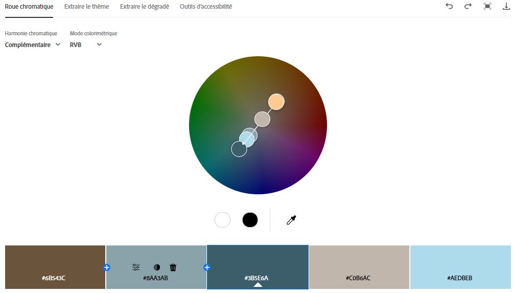
To help you choose the right colors and create harmonious palettes, you can use the tool Adobe Color. This online tool allows you to easily generate consistent color palettes that match your needs, while taking into account color psychology.
The influence of colours on emotions and perceptions
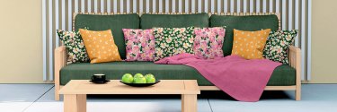
Each colour has one meaning and one psychological influence. In textiles, these shades can energize an outfit, soothe an interior or catch attention at an event. Here are some colors and their most common effects:
| Colour | Emotions or Message | Ideal use in fashion and event | Associations with other colours |
|---|---|---|---|
| Red | Energy, passion, love, urgency | Sportswear, high energy events, bold accessories | Good with black, white, gold, silver, or neutral colors |
| Blue | Calm, serenity, confidence, professionalism | Uniforms, office clothes, elegant event decoration | Complementary with neutral tones, white, grey or pale yellow |
| Green | Nature, freshness, balance, growth | Eco-responsible fashion, natural events, fashion accessories | Combine it with earthy colors like brown or beige |
| Yellow | Optimism, happiness, attention, creativity | Creative events, summer fashion, bags, accessories, vibrant decor | Fitted with black, white or green tones |
| Black | Elegance, sophistication, mystery, luxury | Eveningwear, upscale accessories, chic decoration | Match it with almost all colors: gold, silver, red, white |
| White | Purity, simplicity, freshness, clarity | Summer fashion, minimalist decorations, weddings | Additional with almost all colors |
Tip Before finalizing your design, ask yourself what message your printed fabric should convey. A good choice of colours can make all the difference in the perception of your brand or collection.
Adapt colors based on audience and message
The secret of a successful textile? Choose colors adapted to your target and its universe.
- For fashion : Trends are changing, but some rules remain. Black and white are timeless, while pastel colours bring softness and romanticism. If you create children's clothes, bright and joyful hues will be more engaging.
- For furnishing : Colours influence the atmosphere of an interior. The neutral tones (beige, grey, off-white) sooth and adapt to all styles, while the warm colors (terracotta, mustard, burgundy) bring character and a cosy touch.
- For the event : In a stage decor or costume, colors must capture attention and transmit a strong emotion. A deep blue background evokes magic and dream, while an intense red decor energizes space and stimulates action.
> Think strategy! Adapting your colorimetric palette to the context and target audience enhances the impact of your creations and ensures their success.
2. The importance of colours in textile customisation
When you create a printed fabric, you don't just choose a material or pattern: you select a color palette which will give a strong identity to your creation. Whether it is to distinguish a brand, harmonize a collection or convey emotion, colours play a key role in the perception of your product. A wrong choice can make your design fade or inconsistent, while a good selection will immediately captivate your audience.
How do you use the colors well so that your printed fabrics have a strong impact and mark the minds? Follow the guide !
Visual identity and brand recognition
A colour may be sufficient to recognize a mark. Think of Coca-Cola red, Facebook blue or Starbucks green. In textiles, it's exactly the same thing: a well thought out palette strengthen your brand image and creates an instant connection with your audience.
Why choose consistent colors for your brand ?
- They create a strong and memorable identity.
- They facilitate immediate recognition your creations.
- They drive the values and universe of your brand.
Concrete case: fashion and brand creators
If you launch an eco -responsible collection, it will be more strategic to opt for natural tones (beige, olive green, brown) rather than flashy colors that evoke pop culture more.Conversely, if your brand is dynamic and urban, strong contrasts and bright colors will better captivate your target.
Concrete case: fabrics for events
A textile decor for a wedding will favor soft and elegant hues (white, champagne, powdery pink), while a sporting event will focus on intense and energizing colours (red, orange, electric blue).
> Golden Rule : Identify the universe of your brand or project and select colors in accordance with your message.
Harmonisation and contrast: choose your combinations
A successful printed fabric is not just a beautiful color: it is also a good balance between the shades. Too many poorly combined colors can blur your design, while a well thought out palette will give relief and harmony to your creation.
How do you combine colors ?
Use the chromatic circle
- Additional colours : they contrast on the circle (e.g. blue and orange) and create dynamism.
- Similar colours they are located side by side (e.g. blue and green) and give a feeling of harmony.
- Monochromatic pallet : A single color declined in several shades for an elegant and sober rendering.
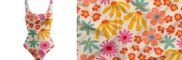
Example : For a minimalist collection, opt for similar or monochromatic colours. Conversely, for a streetwear line, dare complementary colors for more impact.
Play with contrasts
- A light background with dark patterns immediately attracts the eye.
- A shades of pastel colors brings softness and lightness.
- A mix of lively and neutral tones balances the whole without attacking the look.
> Good to know : Colour perception varies among audiences. A pastel pattern will be perceived as refined in France, while in India or Latin America, bright colours are more appreciated.
If you are looking for inspiration for your projects, discover the 5 trends essential patterns for the summer 2025, which will help you anticipate styles to adopt for your printed fabrics.
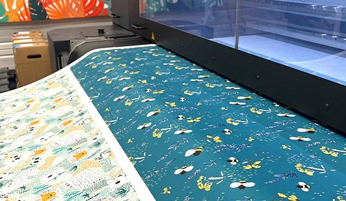
3. The technical characteristics of textile prints and their impact on colours
You have carefully chosen your colors, harmonized your palette and imagined a striking design.. But did you know that the final rendering can vary depending on the printing technique and the material used ?
In textile printing, color fidelity depends on several factors : printing technology, the type of fabric and even the colorimetric profile. A bright color on screen can appear duller on a poorly adapted fabric. So how can you guarantee a result that is true to your creative vision? Together, let us decrypt the key elements to be taken into account.
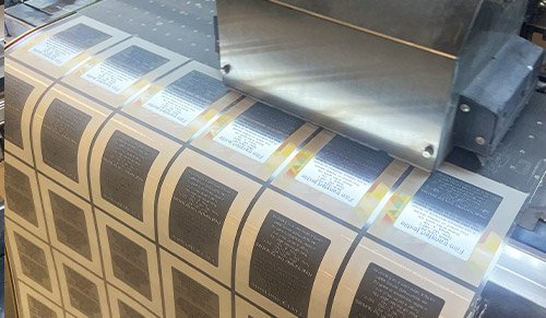
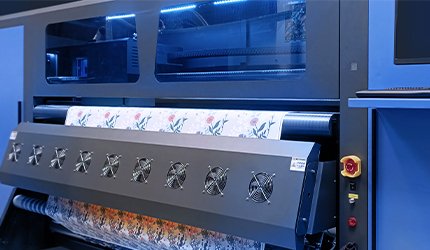
Differences between textile printing technologies
Not all textile printing methods react in the same way to colours. Some offer a higher intensity, others allow a more natural rendering. At Fabrics Print, we use three technologies adapted to the different needs of creators.
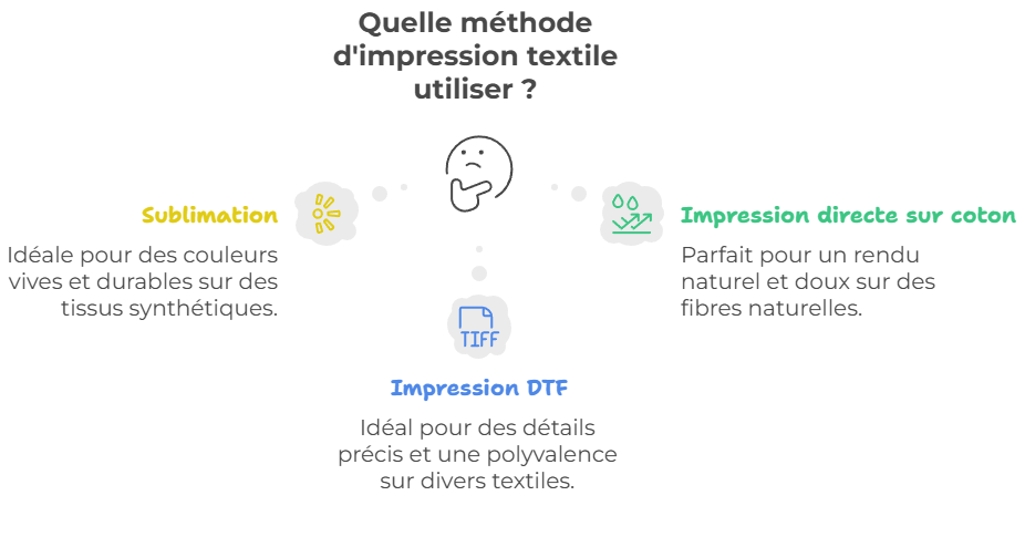
1. Sublimation: bright and durable colours
- Ideal for synthetic fabrics (polyester and derivatives).
- Excellent intensity and saturation of colors.
- Resistant to washing without loss of shine.
> Ideal use : perfect for upholstery fabrics requiring bright colors and excellent hold over time.
2. Printing Direct inkjet on cotton: natural and precise
- Allows to print directly on natural fibres (cotton, linen, etc.).
- Made soft, slightly attenuated colours for a more authentic effect.
- Ideal for vintage or bohemian designs.
> Ideal use : cotton clothing (robes, shirts), tote bags and creations with natural hues.
3. DTF (Direct To Film) printing: versatility and accuracy
- Suitable for almost all textiles (cotton, polyester, mixtures...).
- Excellent definition of intense details and colors.
- Wash resistance and great flexibility.
- Allows to print complex areas with gradients and small patterns.
> Ideal use : detailed and multi-support textile customizations, ideal for designers and professionals looking to print accurate visuals.
Council Before starting a production, ask for a print test to see the exact rendering of your colors on the selected textile.
The influence of the type of fabric on color rendering
Even with the best printing technology, the choice of fabric plays an essential role in final rendering. Each material absorbs ink differently, which can alter color perception.
Synthetic fabrics (polyester, lycra, softshell...)
- Faithful restoration of colours, especially in sublimation.
- Perfect for bright and contrasting hues.
Natural fabrics (cotton, linen, silk...)
- Greater absorption, giving a softer and slightly attenuated rendering.
- Material" effect that can add seal to certain designs.
Thick vs. thin tissue
- A thick fabric can slightly darken the colors (e.g. a thick cotton sweatshirt compared to a light t-shirt).
- A lighter fabric lets light pass better, which can alter the perception of nuances.
Good to know : The bright colors will come out better on a light background, while a dark fabric will require a white underlayer to ensure the tints are accurate.
4. Tools and tips to choose your colors
You have a precise idea of your design, but how can you be sure that the selected colors will come out exactly as you imagine? In textile printing, a poor colorimetric rendering can transform a deep blue into a dull blue, or a bright red into an orange shade.
Fortunately, there are tools and good practices to avoid these gaps and ensure a true result to your vision. Here's how to optimize your colors for a successful textile print.
Use of online customization tools
At Fabrics Print, we developed innovative tools to help you visualize your creations before printing. Whether you are a seasoned designer or a novice in textile customization, these solutions allow you to test and adjust your colors in just a few clicks.
Online customization simulator
- Download your design and apply it directly to our fabrics.
- Test different color combinations to see those that work best.
- View the rendering on several materials before you validate your choice.
The IA image generator
Don't you have a graphic designer? Our iA pattern generator helps you create original patterns without design skills.
Select a style, describe your idea, and let AI generate visuals adapted to your needs.
Ideal for creators who lack inspiration or those who want to save time.
Why use these tools ?
- Time saving : no more need to do several physical tests, you see the rendering before printing.
- Accuracy : adjust your design to suit the fabric and printing technology chosen.
- Less errors avoid bad surprises by controlling your colorimetric palette in advance.
> Council : Before validating a command, test several color variants on the simulator to find the perfect combination.
Good practices to ensure accurate rendering
A design can be perfect on your computer... but completely different once printed. Why? Because screens and inks do not use the same colorimetric modes. Here's how to avoid color differences.
Understanding the difference between RGB and CMYK
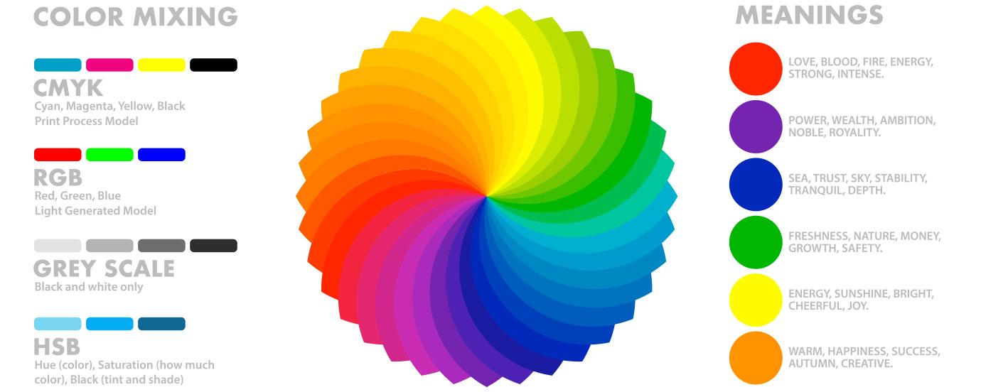
- RGB (Red, green, blue): used for screens, this mode displays vibrant colors thanks to light.
- CMYK (Cyan, Magenta, Yellow, Black): used in printing, it reproduces colors with pigments. If you want to optimize your files for textile printing, it is essential to prepare your document well according to these color modes. Discover our complete guide to prepare the perfect textile printing file to avoid common mistakes and ensure impeccable rendering.
> Tip : Always convert your design to CMYK before printing to get a true look.
Check the colorimetric profiles
- Each printing technology has a specific colorimetric profile.
- Think about calibrating your screen to avoid bad surprises (use a tool like a colorimeter).
Test before printing in large quantity
- Order a sample before launching a full production.
- Test your colors on several types of fabrics to see how they react.
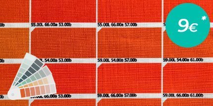
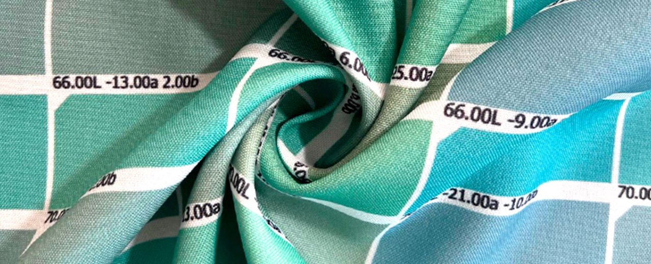
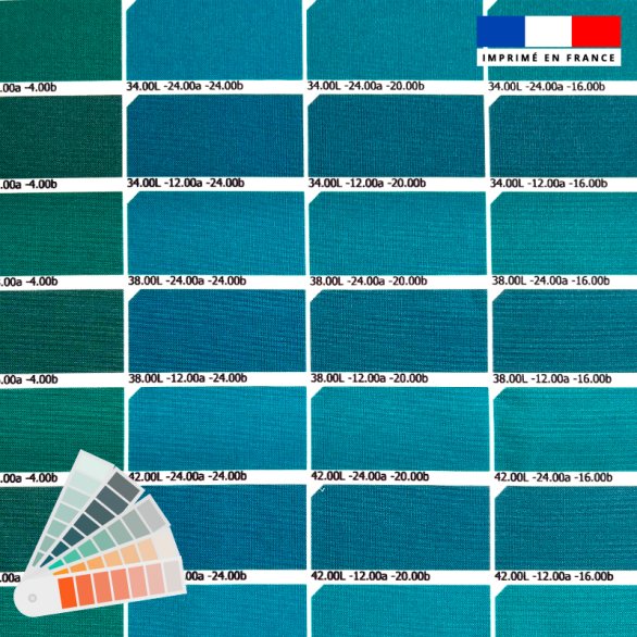
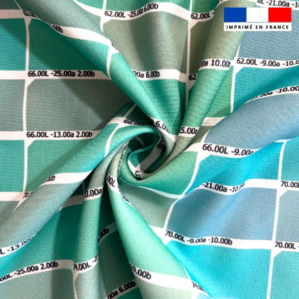
Bonus: use a colour chart
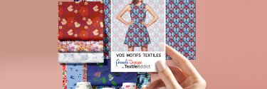
Do you hesitate between different shades for your textile project? Nothing is worth a physical colour chart to visualize the exact color rendering on fabric before printing.
At Fabrics Print, we offer you the possibility of create your custom colour chart. With our unique service you can print more than 100 color variations directly on the matter of your choice.
Why choose our personalized color chart ?
- Colour accuracy Get a sample printed from your own color code (RGB, CMYK, Lab).
- Material of choice : Test your colours on the exact fabric you will use for your project.
- Ideal for professionals : Designers, designers and textile brands thus guarantee a faithful rendering before production.
- Local manufacturing : High quality printing made in France with OEKO-TEX certified inks.
How to create your personalized chart ?
- Choose the material that fits your project.
- Select the desired colorimetric mode (RGB, CMYK or Lab with custom profile).
- Enter your color code for faithful reproduction.
- Validate your order and receive a specific colour chart for your tests and validations.
> Save time and make sure a perfect look with our custom to measure. An indispensable for all demanding designers
Conclusion: Give your printed fabrics the impact they deserve
The choice of colours must never be left to chance when it comes to textile customisation. Each shade influences emotions, attracts attention and shapes the identity of your creation. Whether you're looking to enhance a fashion collection, create a striking event setting or strengthen your brand image, a well-thought-out palette is essential to capture your audience and convey your message.
- But beyond the aesthetic aspect, the success of a textile project also depends on technical aspects:
Choosing its colours well according to their symbolic and psychological impact. - Take into account the specificities of printing materials and technologies to ensure faithful rendering.
- Use the right tools – customization simulator, IA image generator, samples – to avoid bad surprises.
With Print Fabrics, you have all the cards in hand to design unique, expressive and impeccable printed fabrics. Our online tools and expertise in textile printing allow you to bring your ideas to life without compromising on colors and details.
Need to test your creations before printing ?
Explore our simulator and let yourself be guided by our technology to get a perfect result from the first impression !
> It's up to you: transform your inspirations into exceptional fabrics !


0 commentaires